

The Limitations of Video Analytics
Most performance-oriented tech platforms typically provide some semblance of reporting, however, the quality and clarity of that reporting vary greatly from provider to provider. This same logic applies equally for video analytics providers, and many OTT video software solutions weren’t able to clearly present information on what was happening with a particular video file at a given time. This lack of clarity would produce an unlimited level of uncertainty as to what was performing and what wasn’t. Our team got together and addressed this issue by honing in on the needs of the end-user and creating a solution that would highlight what was happening with every video file being processed in a single view. Our solution came in the form of enhancing a few key reports within our dashboard; most recently the information about individual user sessions via Session Visualization and Session Monitoring.
Displaying Granular Data – Session Visualization
One of the most critical advantages of video analytics is the depth and granularity of the displayed data, allowing users to closely track a variety of metrics. These metrics can enable an OTT service to optimize their workflows for efficiency and reduce or prevent costly errors from disrupting their consumers’ quality of experience. However, simply providing this information is seldom enough to draw insights or incite action, the information should also be visually appealing and yield an action item.
Within the Analytics view of the Bitmovin Dashboard, information like user behavior, bitrate expenditure, and other valuable events are displayed on the “Latest Sessions” detail screen with various session visualization graphs (depending on the event). In an effort to maximize critical information in a concise and visually appealing manner, the Analytics and Design teams incorporated smaller tables alongside each session line – thus saving space while retaining the same amount of useful information. You can see an example of the session visualization tables below:
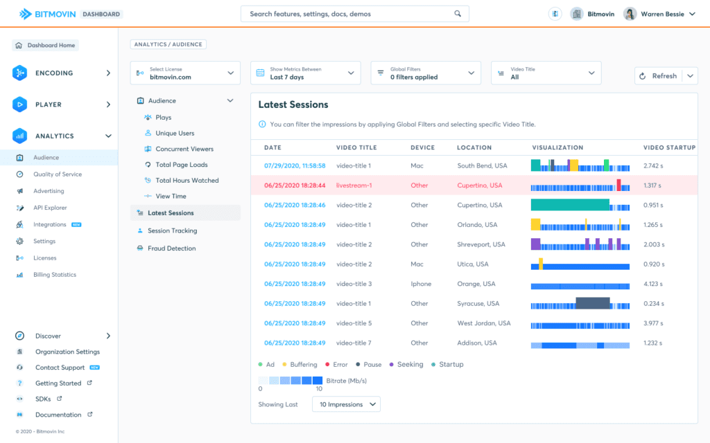
In addition to the color variance for actions within the video and blue gradient for bitrate expenditure, the blue display bars on the detail screen have two levels of height,
- Short blue lines indicate the bitrate level and the typical user behavior while watching a particular video and vary in shade depending on the bitrate fluctuation.
- Taller, colored bars indicate any event that may interrupt a session. They’re purposefully designed to be twice the height of the smaller bar, so they are easily distinguishable.
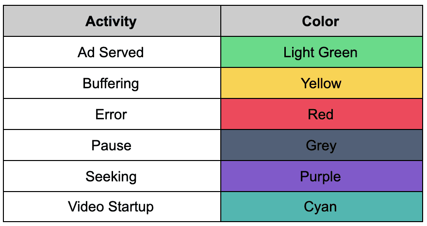
The session disruption bars are broken out as follows:
Digging Deeper with Video Analytics Session Monitoring
This first view is excellent for high-level oversight of a platform or app’s performance and in-line with our goals to provide insightful, granular data, we’ve included an additional view for each specific session.
Below the “Latest Session” tab, one can find the monitoring view under the “Session Tracking” tab which uniquely displays a specific session’s parameters. The session monitoring provides an in-depth table that includes session length (size of circle), bitrate (color blue, from light to dark), and if there are any errors (red dotted line or full circle). When opening the monitoring screen, the user is met with an inviting ripple animation that undulates and pulses attractively as it comes to rest to display the information. The intention is to draw the eye into the display and highlights those sessions that are causing issues or alternatively, working well.
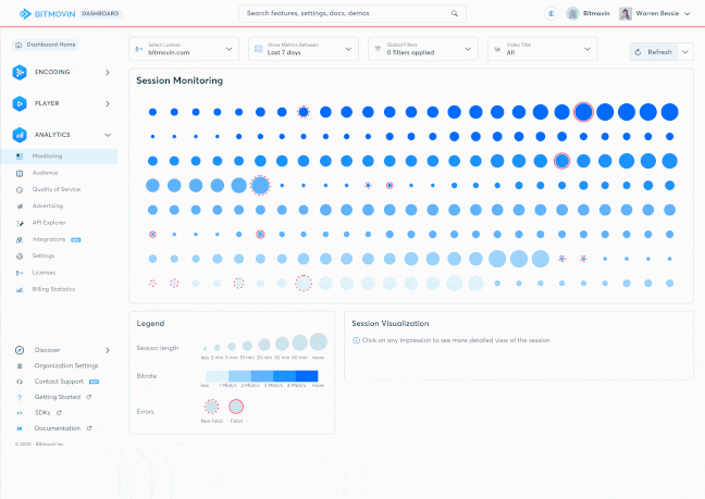
This dot-based visualization is a combination of a classic Bubble Chart, Dot Matrix Chart, and a Heatmap. The use of the dot size, color opacity, and proportions prioritize sorting by color first, and then the dot dimension, thus drawing the viewer’s attention to the highest priority activities for an individual session. When an error occurs, two kinds of red circles can appear – a dotted red circle denoting that the error is not critical to the session, and a red circle with a complete outline indicating a session failure.
While the overview of all the sessions is the default view, this deeper dive view with detailed analyses of session details can help determine common patterns of behavior for each session. The design takes into account the fact that our main target audience views our Analytics product on large monitors. The session visualization scales accurately to accommodate large displays, while maintaining its responsive nature.
Go Forth and Analyze
When managing any OTT or streaming service, it’s essential to manage the performance for peak quality and delivery. A dashboard that illustrates granular data in a visually appealing and actionable manner will help improve the consumer experience and reduce churn by making sure that customer-facing employees enjoy their work and know exactly what to look for at every level of a video workflow.
Did you like this post? Check out some of our other analytics content:
- [Blog Post] Why you should have a healthy obsession with startup time
- [Blog Post] Reducing Redundancy with Bitmovin’s Video Bitrate Heatmap
- [Infographic] Cost of Errors for SVOD and AVOD services