


TL;DR
- Operations teams have requested native custom dashboarding in Bitmovin’s Observability solution for years, and existing workarounds require developer involvement they should not need.
- Over a two-day hackathon, we built a working proof of concept: a new Custom Dashboarding view with drag-and-drop, resizable widgets, global time-frame controls, and one-minute auto-refresh, all configured through a no-code UI.
- It supports three widget types (line charts, single-value scorecards, and tables) with group-by, filtering, order-by, and multi-query overlays with two querying modes: metric or custom querying.
- This is a proof of concept, not a production feature. We built it to validate complexity and show what the experience could look like.
Bitmovin’s Observability solution already gives teams deep visibility into playback quality and audience behavior. But when an operations team wants to assemble its own view of that data via our API, the current answer is to build it in a tool like Grafana. That works, and it is powerful, but spinning up and maintaining a Grafana instance is something many customers would rather not take on, and others simply lack the resources or in-house capability to do. On top of that, it lives outside the product they already use every day. For operations-focused users who are not developers, that is a real barrier.
During a recent quarterly hackathon, we wanted to answer a simple question: what would it take to build custom dashboarding directly into Observability, and how hard would it actually be? Two days later, we had a working prototype and a clear answer to both.
Why dashboarding should not require a developer
The request for native dashboarding is not new, and it does not come from one place. The feedback we kept hearing was consistent:
- Closed-loss notes citing the absence of custom dashboards as a deciding factor
- Competitive comparisons to analytics platforms that offer native dashboarding
- Direct RFP requirements asking for dashboard creation within the product
- Internal discussions about how to serve ops teams alongside developer users
The common thread is ownership. Operations teams want to build and maintain their own visibility tooling without routing every change through an engineer. The Grafana path does not fully close that gap: setting up a dashboard means knowing what to query and how to build it, and adjusting one later depends on someone with that knowledge having the time to do it. So when a view needs to change, it often becomes a wait on engineering rather than a quick change the team makes itself. Keeping the workflow inside the product, owned by the team that relies on it, lets them create and adjust dashboards as their needs shift.
What we built
We added a Custom Dashboarding view to the Observability solution. From there, users can create and manage dashboards entirely through the UI, with no code required.
The layout is drag-and-drop with fully resizable widgets, multiple dashboards each independently configurable, global time frame controls, and auto-refresh on a one-minute interval. We used the React Grid Layout library for the drag-and-drop and resize behavior, which handled the layout mechanics and let us spend the two days on the data layer and the widget configuration experience instead.
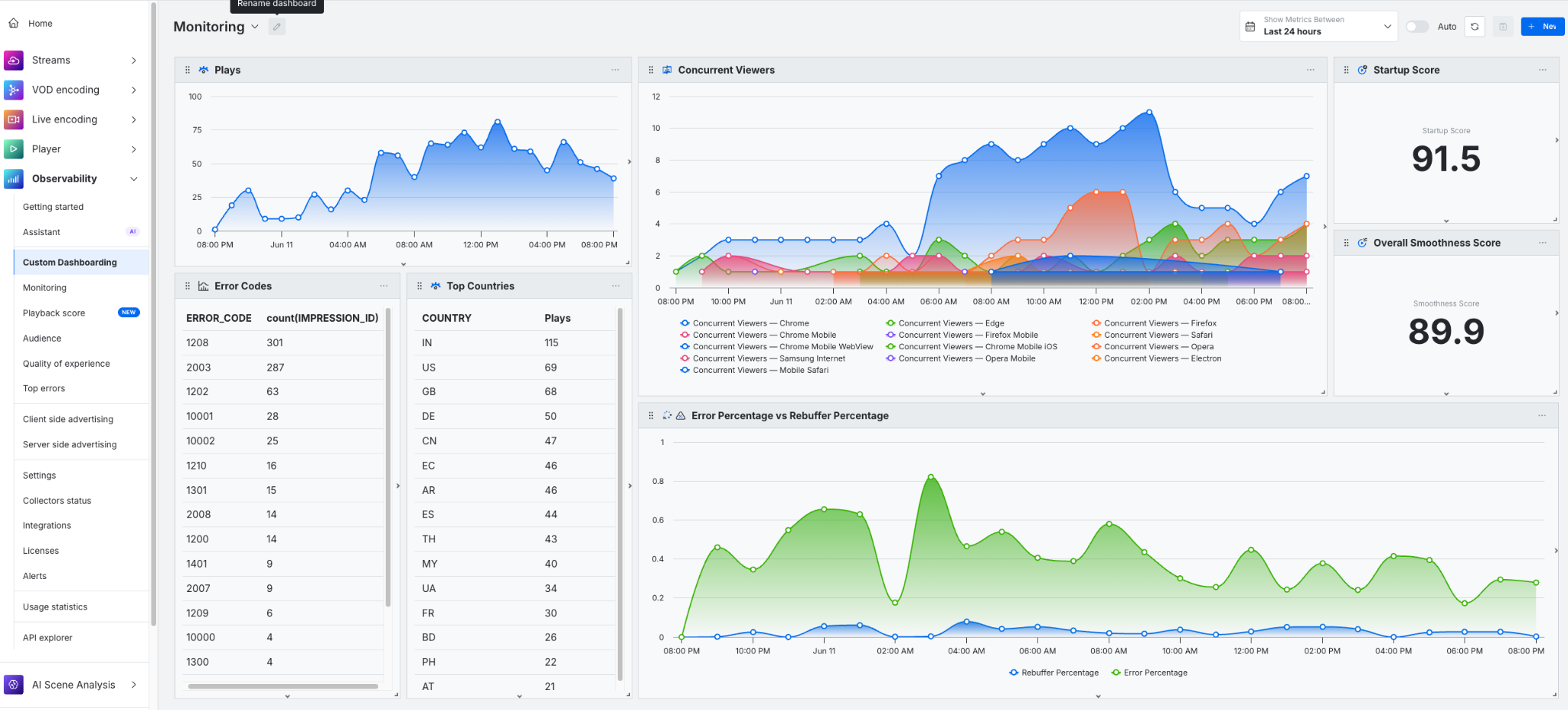
Custom Dashboard that showcases all three widget types. The Concurrent Viewers line chart is grouped by Browser and the Error Percentage vs Rebuffer Percentage line chart showcases the multi-query feature.
Supported widget and query types
We currently support three widget types, each with its own configuration options.
Line charts support:
- Single or multi-query overlays, so you can compare the same metric across two licenses or data segments in one view
- Group-by dimensions such as browser, country, or device type
- Filter configuration to scope the metric to a specific country, browser, or other dimension
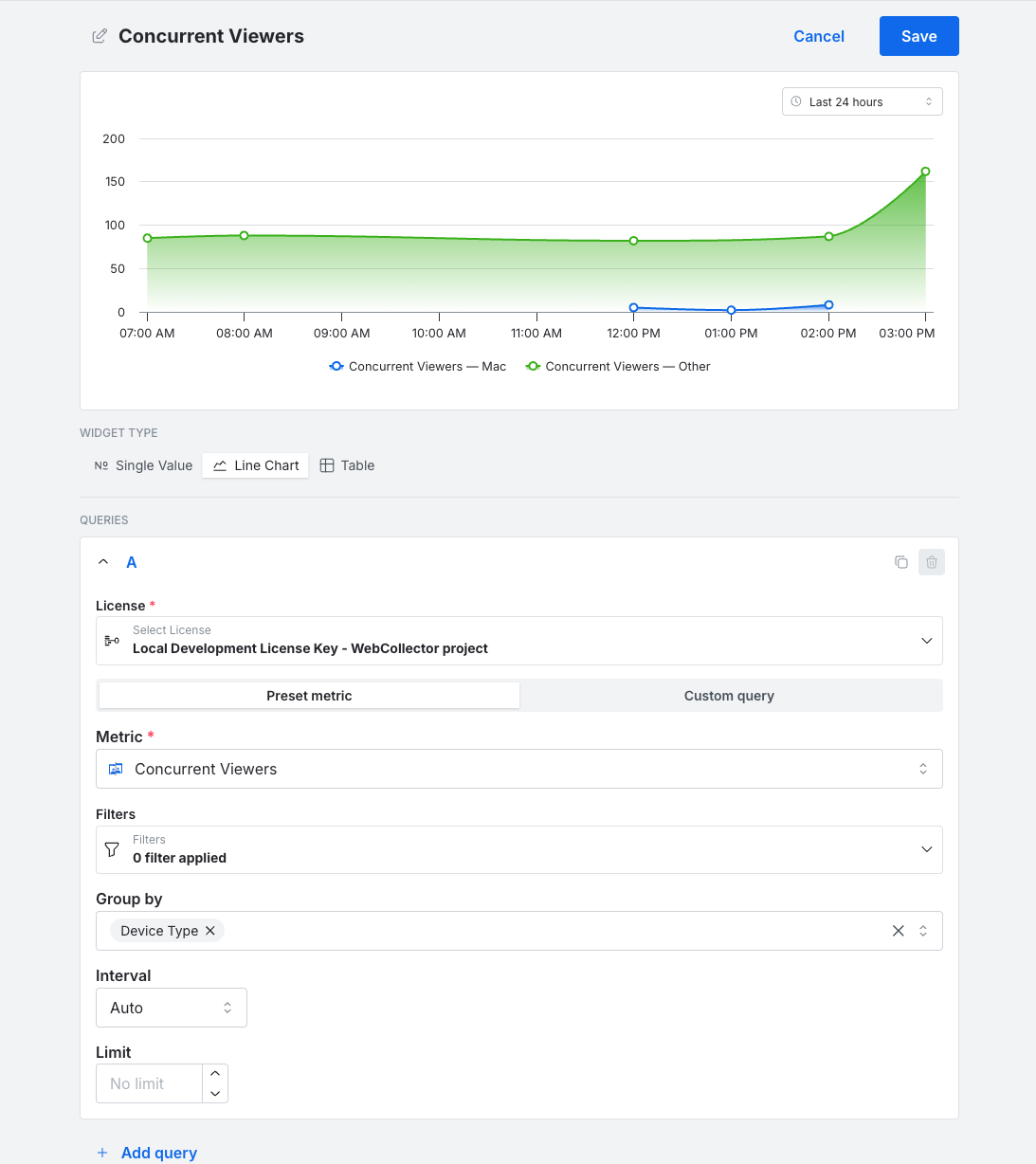
Line chart widget editor showing Concurrent Viewers grouped by device type, with a live preview rendering two lines over the last 24 hours.
Tables support:
- Group-by dimensions
- Order-by controls for building top-N rankings, for example top browsers by session count or most frequent error codes
- Descending or ascending sort
- Filter configuration to scope the metric to a specific country, browser, or other dimension
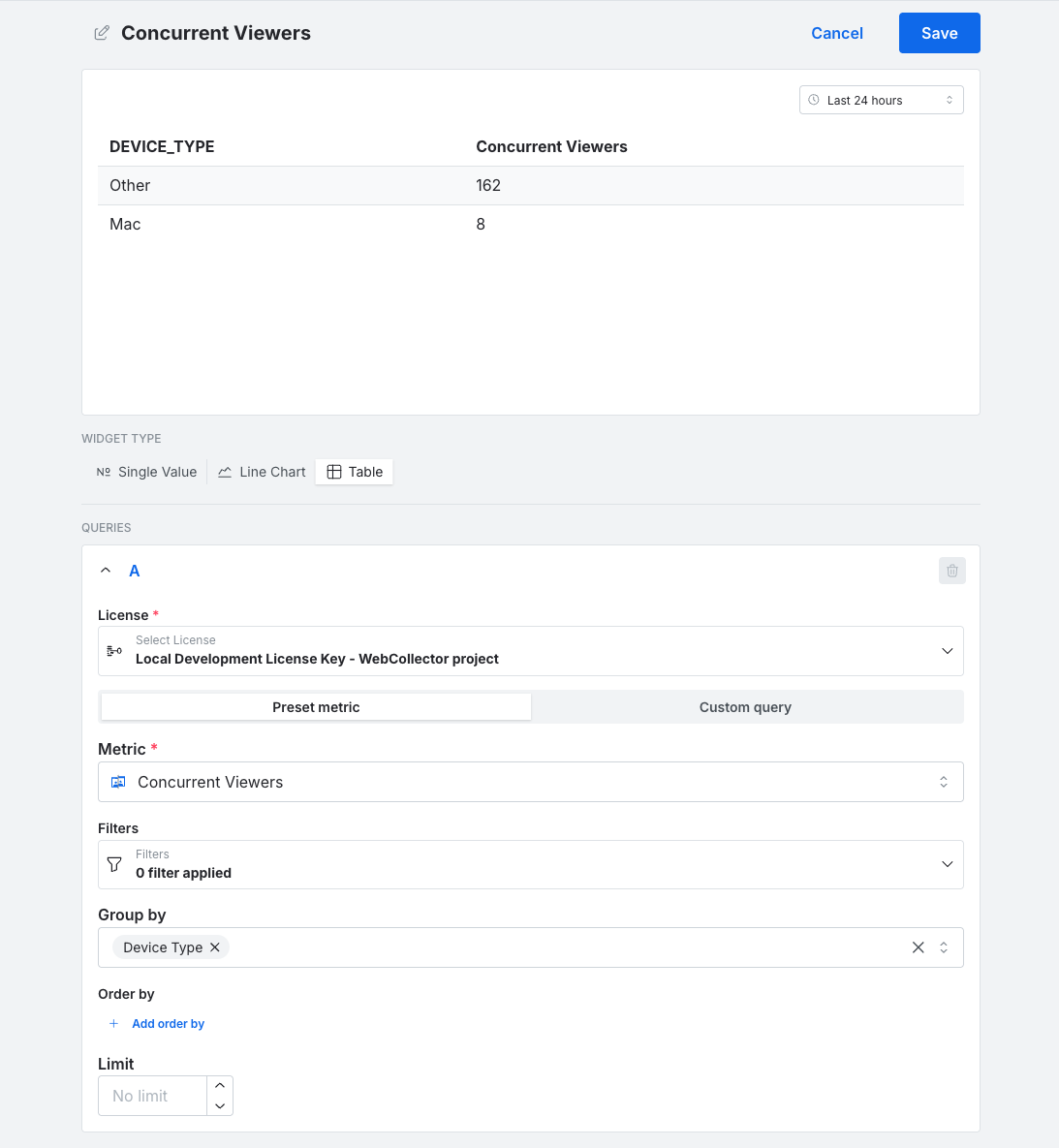
Table widget editor showing Concurrent Viewers grouped by device type, with a two-row preview displaying counts for Mac and Other.
Single-value scorecards support:
- Filter configuration to scope the metric to a specific country, browser, or other dimension
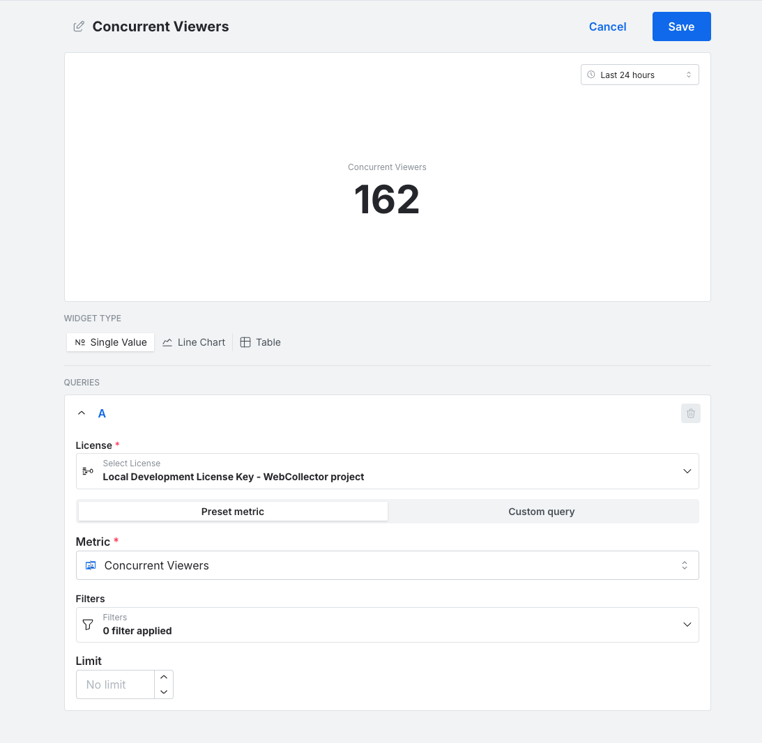
Single-value scorecard widget editor displaying a Concurrent Viewers count of 162 in the live preview.
For creating queries across the three widget types, two modes are available:
- Metric querying uses a preset metric from those already available in the audience and quality-of-experience tabs, such as Plays.
- Custom querying lets you define an aggregation, for example a count, over a dimension yourself. This brings the flexibility currently available through the Grafana integration natively into the product UI.
Both modes share the same filters, group-by, interval, and limit controls.
The widget editor also includes a live preview. A chart sits at the top of the editor with a selectable time frame, for example the last 24 hours, and renders as you configure the query, so you can see how the data will look before saving the widget.
Custom query builder
To show what custom querying looks like in practice, we built an error code breakdown from scratch during the demo. We set a count on impression IDs, filtered to error sessions, grouped by error code, and rendered it as a table sorted by frequency. The whole thing took under a minute to configure.
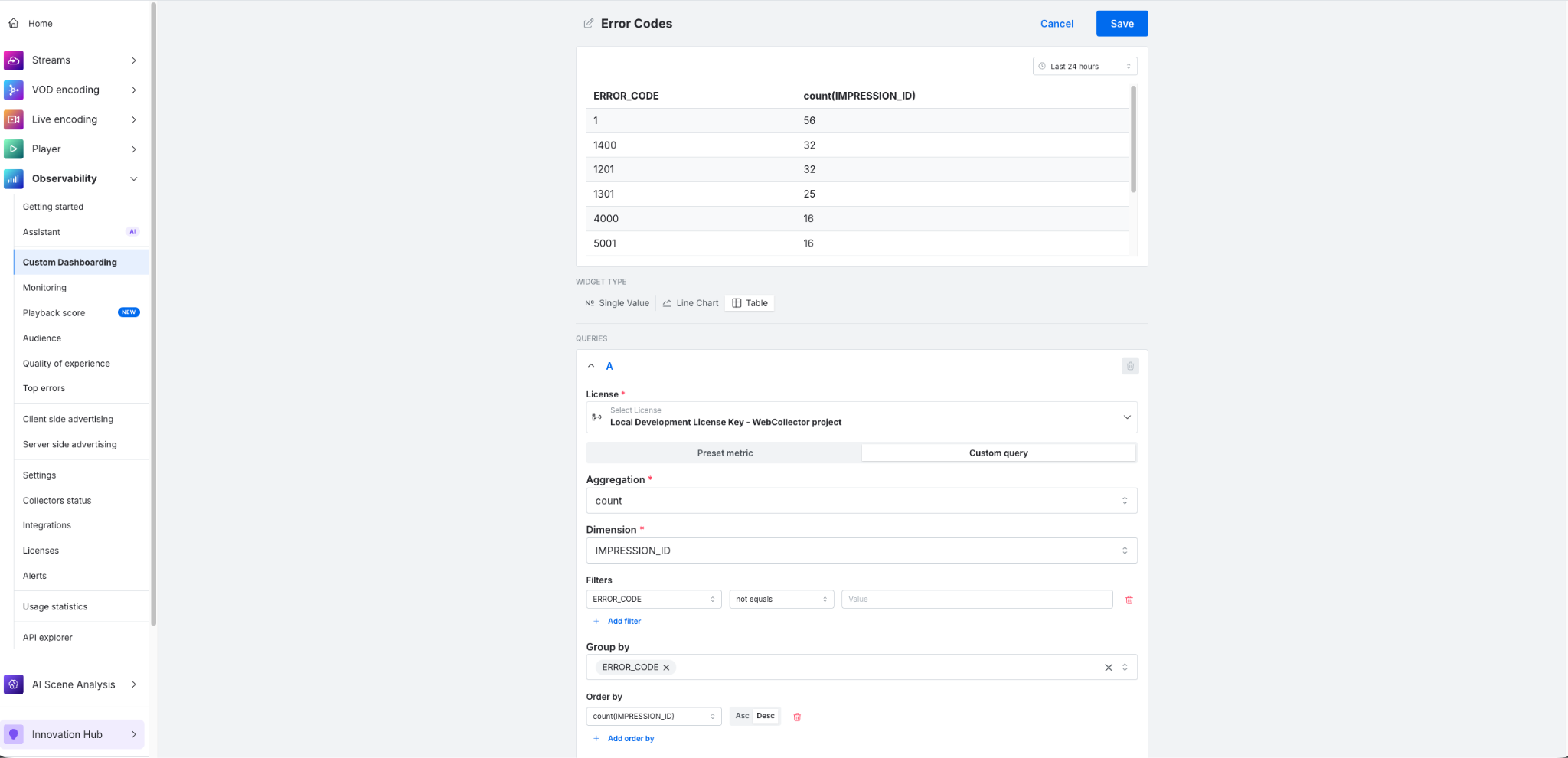
Widget editor with custom query builder configured to count impression IDs grouped by error code, with results displayed as a sorted table in the widget preview.
How we built it in two days
Before writing any code, we planned thoroughly. We decided which features were in scope and which to leave out, and what we wanted the prototype to prove. We looked at which UI libraries we could build on instead of reimplementing things that already existed, which is where React Grid Layout came in for the drag-and-drop grid. We also went through our existing codebase to see how much we could reuse, to estimate how much effort a real production feature would take, and to identify where we would need to restructure existing code rather than write it from scratch. Each feature was then broken down into smaller steps.
From there, we handed most of the code generation to Claude Code and reviewed the output in small, incremental steps. That review process was deliberate: we wanted a realistic estimate of what it would take to integrate this into our existing codebase, not just the cost of an AI-generated greenfield project.
To keep complexity down, we scoped the build to the frontend only and stored dashboard state in local storage rather than behind a backend.
Our goal was to validate how complex a full production implementation would be and to show what the experience could look like. On both counts, we came away with clear answers. And because it runs on a staging environment, the prototype can also serve as an early preview in customer conversations, giving us a way to gather direct feedback on the direction before committing to a full build.
What comes next
Even with a no-code UI, creating dashboards is a manual and repetitive process. Each widget is configured on its own, each query is set up by hand, and the custom query mode assumes a familiarity with metrics, dimensions, and aggregations that not every user has.
Describing what you want in plain language removes most of that. A user could say, “Create a dashboard for live-stream monitoring on these metrics,” and have it built for them, without configuring it widget by widget or needing to know how to write the underlying queries.
Bitmovin already has an MCP server that supports a range of use cases, including querying Observability data. So one direction we discussed is, once the backend layer exists, to add support for it to both the MCP server and the Observability Assistant in the Dashboard. Dashboard creation would then become faster and more approachable through natural language, with no one having to assemble it by hand.
For now, this is a prototype but we are looking to add it to the capabilities of Bitmovin’s Observability soon.